

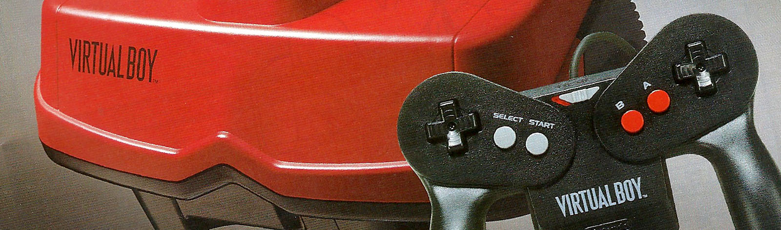


Here’s the latest two. The banner on baseball is awesome. And the space invader label is super crisp and clean looking. Love it.


Here they are. Very nice. Any plans to do all your labels?


A few I missed.


And another TheRedMenance batch.


DeAthWaGer batch


Here’s the latest Morintari batch on the eInk display.


Looking pretty good.
The small text on the Galactic Pinball is hard to read.
Attachments:


brumbie13 wrote:
Hey Kevin, just curious, do you still think you’ll end up doing the MultiBoy32? I held out on buying this one because I liked the idea of the MultiBoy better, but more and more this project seems to be shifting into the MultiBoy and I’m feeling like maybe I missed my chance to get on board this project if you don’t end up doing any further batches/orders.Thanks.
It’s on the list but you never know. At this point MultiBoy is an idea. HyperFlash32 is being built. I could see HyperFlash keeping me busy for a while. I can give a better estimate most likely at the end of this year.
Next batch. Color bars are great. Thanks to everyone for adding them.


indcsion wrote:
I can scan the rest of the games I have if these are of any use.
Thanks for the scans.
These would need to be cleaned up quite a bit to remove scan noise and then put in the eInk format before they could be used.
Last one for the night.
You guys are getting good at this!
Attachments:

The Red Menace wrote:
A few more from me 🙂
Awesome. I’ll get them on the display.
Thanks for adding the side color bar!
🙂
Attachments:

Here’s the next batch.


VirtuousRage wrote:
Here’s my entry. 😀
I to went with a more classic label approach.Took the label I made for the English reprints and converted it for E-Ink.
I’ll probably do every game’s logo, but here’s “Virtual Bowling”!
Very very nice. I love the bars at the right too because I can tell the conversion went correctly and it’s not just that a particular gray level was excluded from the art.
If people can, please copy VirtuousRage and put in the color bars. It helps a lot.
I also like that the vertical is full as the cutout should end up centered on the display.
Attachments:

mellott124 wrote:
The Red Menace wrote:
The Red Menace wrote:
I did it all in photoshop, and those are the shades it should have used when I replaced the colours (it seems like it doesn’t want to use them though – maybe it gets an average between the existing colour and what you’ve selected to replace it with? If not, something else has to be going on since it evidently didn’t use the greys it should have). I guess I’ll just get gimp and adjust it there since it’s a proven method. Thanks.I think it was just an issue with my thresholds, everything should be in order now though. Going back to fix them, I found it easier to define them correctly in gimp over photoshop so that it would actually replace with the proper greys. Once I got used to it I did them all pretty quickly. Hopefully this will work better and I haven’t messed anything up this time. 😛
Yep, those look good.
I put some white into the scene and it got even better.
Attachments:

tydyedsyko wrote:
OK, I used mednafen to capture crisper images and Gimp to correct against the correct color palette. I think this one is done.
Looking much sharper. I think there’s a gray level missing but maybe that’s on purpose. Still looks good.
Attachments:

The Red Menace wrote:
The Red Menace wrote:
I did it all in photoshop, and those are the shades it should have used when I replaced the colours (it seems like it doesn’t want to use them though – maybe it gets an average between the existing colour and what you’ve selected to replace it with? If not, something else has to be going on since it evidently didn’t use the greys it should have). I guess I’ll just get gimp and adjust it there since it’s a proven method. Thanks.I think it was just an issue with my thresholds, everything should be in order now though. Going back to fix them, I found it easier to define them correctly in gimp over photoshop so that it would actually replace with the proper greys. Once I got used to it I did them all pretty quickly. Hopefully this will work better and I haven’t messed anything up this time. 😛
Yep, those look good.
Attachments:


The Red Menace wrote:
mellott124 wrote:
I’m posting only two of your images here with the outlined text because it again shows that text looks best with an outline. I like both the white and black versions.
I checked your gray levels and they’re not the correct values. That’s why the scene has lost a gray level. Update them and I’ll rerun. I’d recommend your versions with text outlined by the opposite gray shade. Once you fix the gray levels these should look pretty good. You can see the last attachment where I adjusted the thresholds specifically for your image.
I think moving forward I’ll only test images that are in the correct format. Otherwise I have to rerun images.
Okay thanks, I was a bit worried they might have some issues with the grey levels. And to be honest I’m not entirely sure how to get them to the correct levels, so if you could just tell me how you fixed the one that actually worked, that’d be sweet (and I’d probably do all 8 for the sake of it).
Anyway, thanks for a bunch for all your hard work on this project, and for adjusting one of my images so I could see how it looks on the cart itself – I’m quite pleased with how it looks! 🙂
In Gimp you would go to map and then color exhange. Then just select your gray level and map to another one. You only have 4 levels so it should be quick to do. Make sure you map to FFFFFF, C0C0C0, 808080, and 00000. Then it would be good. Gimp is free to download.
Here’s your adjusted image framed. Pretty nice.
