
Looking good.


retroedge wrote:
I made an account just to follow this (wish I knew how to support these projects and help out!). I just got my first Virtual Boy and am working on repairing the eye ribbons soon.I am excited to find this site with some good projects/support still out there for the VB. I will definitely be ordering one of these HyperFlash32s when it’s available. Hopefully I can snag 2-3.
Thanks for checking it out! Definitely sign up for the PlanetVB Discord channel if you want to keep up on the latest news.
Pistachio wrote:
If you make another batch, please put me on the list for one. Thanks.
I’ll have a couple left over form this batch. PM me if interested. Thanks.
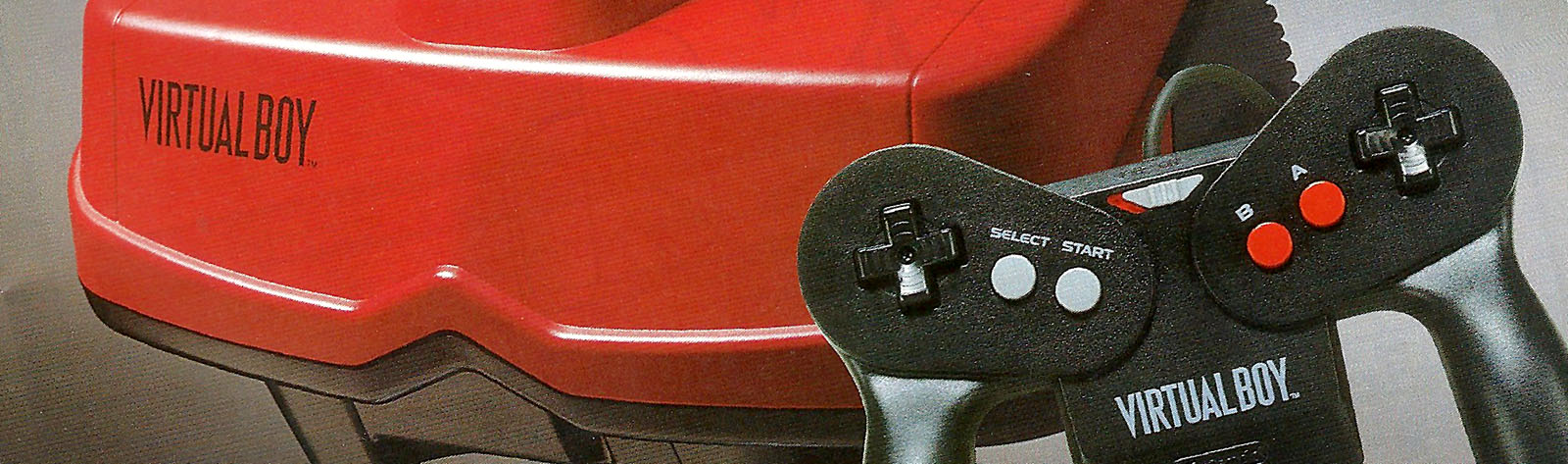
VB controller USB adapter housing prints just finishing for HyperFlash32 contest winners.
Attachments:

OK, got cleaner edges on the latest clear sample parts. These are usable.
Now to find the funding to have the back side mold made.
The cracked one is unique and fun.
Thanks Mumphy!
Great work on the labels. The idea here is to have a coherent set of default labels for released games. I think this will also help people who are less technically inclined and may not be as comfortable switching labels or creating their own. And as Mumphy said, you can replace them if you’d like.
Part of the idea of HyperFlash is to allow customization; if you’re compelled to do so. So far this includes being able to switch out labels and update firmware with future releases. I’m also thinking about allowing font table updates but details are still TBD on that one.
I was really hoping to use the Virtual Boy font as well on HyperFlash but unfortunately gray shades don’t work for partial updates and fonts. I tried just a binary black/white version but it didn’t translate well.
le geek wrote:
Congratulations to all the winners!I reworked the shading of my Mario Clash label to hopefully be easier to read.
It’s been really fun seeing how everyone’s designs work on an E-Ink display! Thank you Mellott for running the contest and for showing us how they look.
Cheers,
Ben
Does look nicer. You were tied for a 3rd place position actually with this label. It was a tough decision. I spent about 4 hours going back over all the labels and re-evaluating them.
Great job.
Attachments:

This one is pure magic.
Attachments:

OK, results are in.
I wanted to control the presentation so I made a new page on my site for the results. It allowed better control of the imagery.
Also accessible via my main page via a post update:
http://www.mellottsvrpage.com/
Here’s the last two. Both very cool.
The Mario Clash one maps really nicely to the display. The brick colors and dithering play very nicely with the various shades. And I love the modified Do-Do character.
Attachments:


I actually just got up. Had a late night working. I’ll draw the line here.
A lot of great entries. I’ll have a post tonight with my selections. Thanks!
And Stereoboy. The graphics are really clean on the display. Was portrait intentional? The white background label is a nice contrast to a lot of the other labels. Nice job.
Attachments:

Here’s the Morintari latest batch. All good ones. I particularly like the Space Invader one.


Both looking really good!


Mumphy wrote:
@Kevin: Super nice of you to give away two carts. Thanks again for the great work you do.Here is another one from me. I’m a bit slow

Edit: I’ll most likely create my own thread for these labels and update in that one whenever I’m done with a new design.
Nice! I like your designs for sure. I’ll try this one soon as I get a chance.
Nice. Here are the updates. The contrast on some of these has improved a lot. I still prefer the ones with outlined text.


The Red Menace wrote:
mellott124 wrote:
You certainly have the most labels! Nice job.Hopefully for the most part I managed to capture both quantity and quality heh heh. I think I definitely improved after getting used to it with the first one, which you can probably see by comparing the it to what came after, especially with Virtual Bowling coming from the batch directly after.
Also see the comparison below to the original & redone versions without the text (the redone versions with text are included, along with, again, another one for Red Alarm, with all my other images in the folder attached to the first post).
I see the improved whites. That will make them look much better.
Let me know which ones I should reconsider. Might help you with the contest…