
I’ll measure my JPN box when I get home.
I insist on giving measurement in mm though 😉
Can you post a close up shot of the sticker so that the text is readable? I can get that translated if necessary as well.
Looks interesting!
Gunpei Yokoi was vilified at Nintendo after the Virtual Boy nearly crippled the company. Despite the fact that it was not rushed through R&D by him, he was made the scapegoat of course.
I imagine they’re paying respect to his memory in their own way, by not spending time on his ‘failure’, even though it was not his fault that it failed. If they’d have waited one more year, the VB could’ve/would’ve/should’ve been full colour because the red and blue LEDs came on the market at an affordable price.
Wow, that IS cheap – unfortunately in Europe we don’t have that option 🙁
You could, but I’m sure you could find cheaper ‘cart only’ listings.
I just got mine too! BIG THANKS!
…so good it got Instagram’d
Sorry to double post, I can’t figure out to to merge or edit a post – but I thought I might try and illustrate what I mean about the interlacing.
I’ve mocked up the 4 tones and interlaced these to try and get mixed colours, but it doesn’t really make much difference unfortunately: [click to full-size, preview has 2600-syndrome]

Of course, you could try the flickering option, but given the VB’s headache issues as-is I can’t see this being a good idea. I have no idea what the refresh rate is (60hz x 2?) and even less about sprite limits, I can’t see it being a viable option to explore.
Attachments:

This is really great of you – can’t wait if you’re able to do a Jack Bros. rip!
ALSO, here’s Blue_Kirby’s WarioLand rip, in case people missed it:
http://www.megaupload.com/?d=69K5RKT7
Ok I get what you’re saying – but at the end of everything, isn’t that just creating the same image dithering anyway?
The difference is that instead of having the chance to review the dithering amount and spread, then clear up pixels after that – you’d have an image with no optimisation.
If you take Photoshop for example, you could have it render any image into ten colours, then have more control over those colours by filling with a defined pattern, but you’ll still need to clear it up afterwards with a quick sweep.
If you want to skip that, you can dither as a pattern, or as noise, which sometimes helps the image representation – but it’s still better to have that control in an image editing program then put into code, rather than trust a machine to do it automatically in my opinion.
Unless I’m really off here and you’re talking about layering colours on top of each other to get a new colour (like Hellraiser NES) – what would be the actual benefit once all the work is done? Even in this example, I don’t think it would work on a VB because visuals are (depending on focus settings) pixel-crisp.
On a TV set you can interlace blue wirh yellow and try to get a green that isn’t in the limited palette. However, on a VB, the colours won’t blur because they’re the same hue and even if they did, you can only mix to a limited extent I’d say. I suppose the best you could hope for is an illusion that looks like 8 shades instead of 4, but I think it’s just as easy to do that directly in Photoshop myself.
Pre-ordered! I’ve waited ages for these books to be available in english, it was tempting to order them in French before.
As would I – Richard is top tier and entirely trustworthy.
He’s also mroe than fair, he’s generous and won’t overcharge on shipping, or even ask for shipping in some cases.
Don’t worry I had the same for a few minutes, it’s no biggie!
Did you click the ROM you want to flash first?
Sorry if that’s obvious, just trying to help as it took me a few seconds first time round and I could easily have missed that…
Can you post a screenshot?
I wish I’d known that, I have the IPD and focus set all the right, it’s all blurry and warped if I do different… Is this bad?
The solution you’re talking about is just dithering. It’s ok for blocks of flat colour, or a simple and regualr gradient, but you can’t really do images with it.
Best bet is (in the case of images) to just embrace the colour limit and work wonders with it using the very limited palette.

Now, the image above reduced to 4 colours (click to illustrate) doesn’t necessarily do this well, but every gameboy game had to do this and the VB does too. What’s challenging is that the gameboy was a simple small screenm, 4 colours was excusable, but the larger resolution of the VB makes things more difficult and challenging.
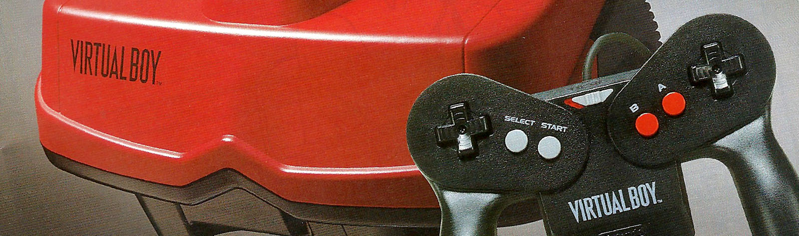
It’s this that I like most about the Virtual Boy, not the 3D feature.
Attachments:

Wow, space invaders bundle went for over 170 bucks…
Oh, I should have clarified I have a Flashboy plus – Minestorm said it’s likely a dodgy contact so I need to buff that battery a little in case it was disconnecting etc.
Coleson beat me to it, but I got a full translation anyway from a contact of mine who was eager to help:
とびだせ!
Pop-up! (Or: Jump Out!)
(Literally it means “jump out!”, but this is referring to the 3D effect like in those pop-up books.)
ぱにボン
Panic Bomber
バーチャルボーイ3Dブック
Virtual Boy 3D Book
とび出す爆弾!
Bombs jumping out! (of the screen)
3Dギャグ大爆発!
Huge explosions of 3D gags!
月刊コロコロコミック9月号付録
Supplement for the September issue of (Monthly) CoroCoro Comic
…it’s a shame as Faceball definitely exists and someone’s just hanging on to it 🙁
Don’t get me wrong, the game looks tripe but I kinda see this topic as videogame archeology and I don’t understand that mentality, personally.
I’ll see if I can get this translated for you for free!